
A dashboard for executives they can actually use for data center builds
A data center delivery leader showed me the four questions every executive asks on a large build. I turned them into a dashboard.

I met Ehab Amin from Oracle at the AI & Big Data Expo in San Jose last month. He has spent years delivering large-scale data center capacity for hyperscale and cloud operators. I told him we are writers, and I asked him one question: what is the hardest problem in your work, and what would you most want to see that would actually help with it?
He wrote back a few days later with a long, detailed answer. Almost none of it was about chips. It was about the gap between what a delivery team knows and what leadership can see.
A modern AI data center program runs across several sites at once. Each site has hundreds of schedule lines in Primavera or Microsoft Project. Those tools are built for project controls. They are not built for a CXO who has ten minutes before a board call and needs to know whether the program is going to hit its megawatts.
So executives ask the same four questions every week. Where are we? What is at risk? What decision is needed? Who owns the next action? Ehab said most reporting answers the first question and skips the other three.
I wanted to see if I could build the screen he described. Here it is.
Why this is hard right now
The reason this matters more than it used to is power.
The constraint on AI data centers has moved off the chip and onto the grid. Nvidia is shipping. Getting electrons to the rack is the hard part. Interconnection queues in the highest-density US markets now run four to seven years, according to Lawrence Berkeley Lab and PJM data. More than 2,000 gigawatts of generation sits stuck in US queues, more than the country’s entire installed capacity.
The equipment is just as tight. A high-power transformer that took 24 to 30 months before 2020 can now take close to five years. Switchgear, busways, and grid-tie batteries are all on long lead times. Sightline Climate tracked roughly 12 GW of US capacity announced across about 140 projects this year, with only a small share actually under construction.
The racks themselves changed the math inside the building. A general-purpose CPU rack draws about 12 kW. An air-cooled H100 rack runs around 40 kW. An Nvidia GB200 NVL72 rack pulls 120 to 132 kW and has to be liquid-cooled. The next generation, Vera Rubin, is being provisioned at close to 600 kW per rack. You cannot air-cool your way out of that.
So a delivery program is now a race against power availability, a transformer order book, and a cooling design, all at once, across several sites. That is a lot to hold in your head. It is far too much for a Gantt chart to communicate to a busy executive.
The dashboard
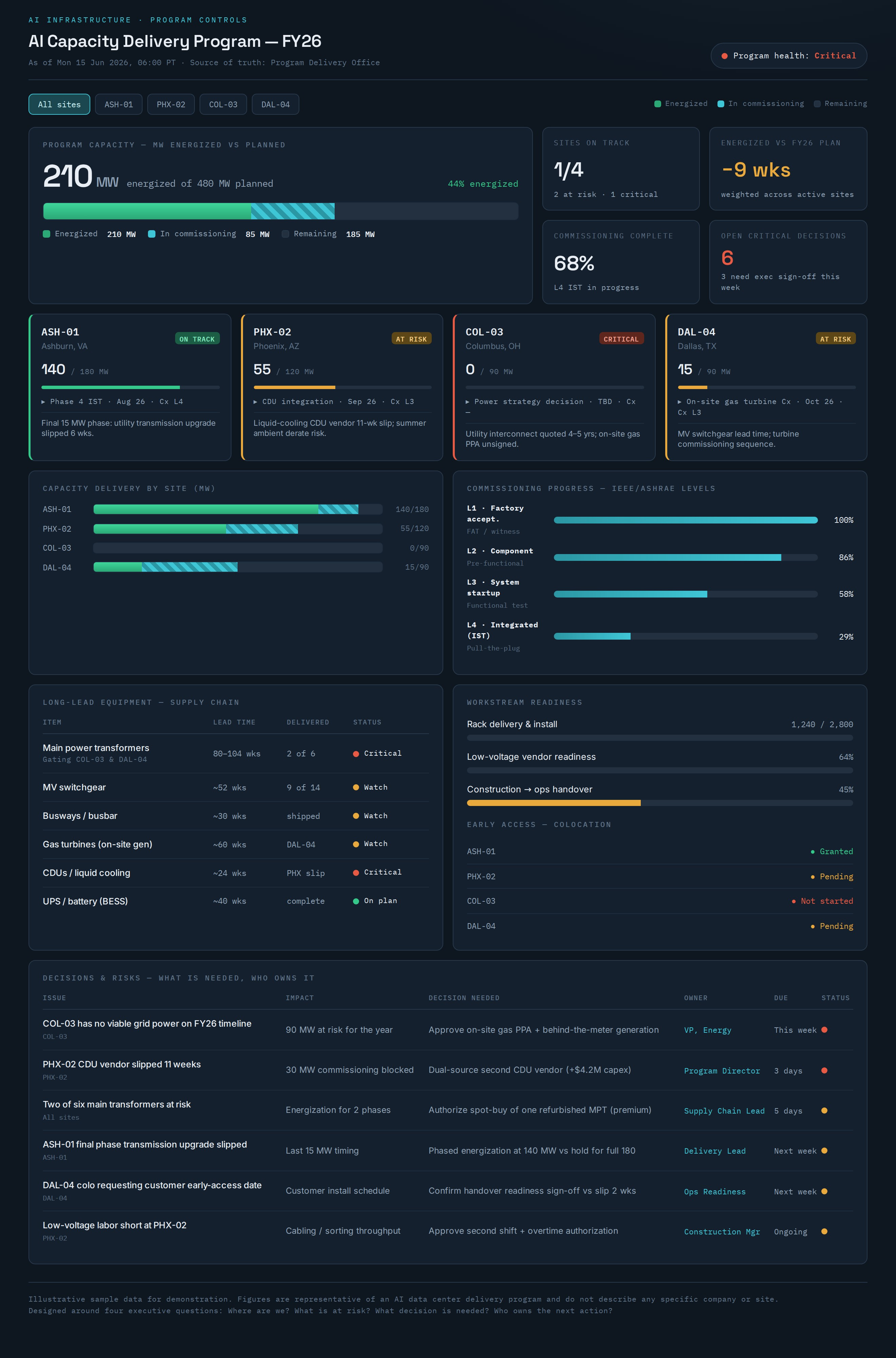
The build I put together tracks a 480 MW program across four sites. The data is illustrative, but the structure is real and maps to what Ehab described.
Where are we. The top of the screen shows energized megawatts against planned megawatts. That single number is what the whole industry is gated on this year. The bar splits delivered capacity from capacity still in commissioning, so you see momentum, not just a total. Below it, each site gets a card with its own megawatts, health color, next milestone, and top risk in one line.
What is at risk. Capacity by site sits next to commissioning progress. Commissioning runs in levels, from factory acceptance through the integrated systems test where you pull utility power and prove the building runs on its own backup. A program can look almost finished and still be months from that test. The long-lead equipment table is the other half of risk. Transformers, switchgear, busways, turbines, and cooling distribution units each carry a lead time and a status, so a slip shows up here before it ever reaches the schedule.
What decision is needed, and who owns it. The bottom of the screen is a decisions register. Each row names the issue, the impact in megawatts or dates, the decision in front of leadership, the owner, and the due date. This is the part most status reports leave out. Telling an executive a site is red does not help them. Telling them the site is red, needs an on-site gas agreement signed this week, and is owned by the VP of Energy gives them something to act on.
Click any site and the whole view filters to it. The portfolio rolls down to a single program. That is the drill-down a program executive actually uses in a review.
One source of truth
The quiet benefit is alignment. On a large program, the construction lead, the commissioning agent, the supply chain team, and the colocation provider each keep their own version of the truth. Status meetings turn into arguments about whose number is right.
A shared view ends that. Everyone reads the same screen. The conversation moves from “what is the status” to “what are we going to do about it.” Ehab made the point that this is worth more than any single metric on the board.
Credit where it’s due
This came from Ehab, who was generous enough to write up his hardest problem in detail after we met. The four questions, the workstreams, and the focus on decisions over line items are his. I just built the screen.
If you work on AI infrastructure delivery and think about the reporting problem this way, I would like to compare notes. Get in touch.
The interactive dashboard is above. The data is sample data, built to show the structure, not any real program.