
ChatGPT Thinks. Copilot Builds. Power BI Proves.
Most Power BI dashboards fail for a simple reason: they start with visuals instead of questions

Most Power BI dashboards fail for a simple reason: they start with visuals instead of questions.
Someone opens Power BI, drags a few charts onto the canvas, adds a slicer, drops in a KPI card, and calls it a dashboard. It may look fine. It may even impress someone in the first meeting.
But then the real questions start:
Why are we tracking this metric?
What does this trend actually mean?
Is this measure calculated correctly?
Can the user act on what they see?
Will the dashboard still work when the data grows?
That is where the combination of ChatGPT, Copilot, and Power BI becomes powerful.
Not because AI magically builds perfect dashboards. It does not.
The real value is that each tool plays a different role.
ChatGPT helps you think through the dashboard.
Copilot helps you build faster inside Power BI.
Power BI helps you validate, interact, and publish the finished product.
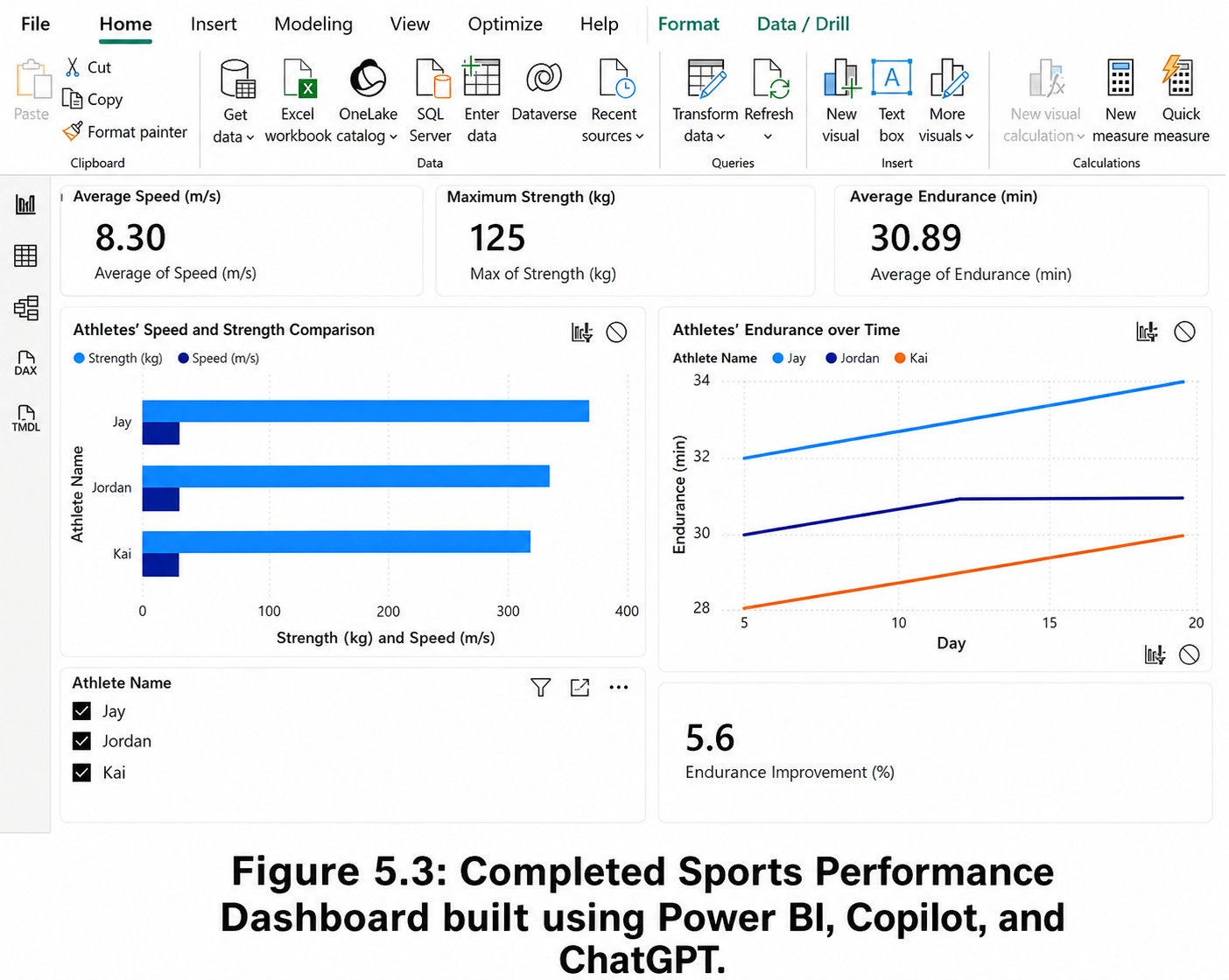
Chapter 5 of Smart Dashboards with Power BI, ChatGPT, and Copilot walks through this idea using a sports performance dashboard. The example is simple enough to understand quickly, but rich enough to show how modern dashboard development is changing.
The goal is to build a dashboard that helps a coach compare athletes by speed and strength, track endurance over time, and identify performance patterns that might otherwise stay buried in the data.
That sounds straightforward. But it raises an important question:
Are we just reporting what happened, or are we helping someone make a better decision?
Start With the Decision, Not the Chart
In the sports dashboard example, the first instinct might be to build three visuals:
A bar chart for speed.
A bar chart for strength.
A line chart for endurance.
That is a reasonable starting point. But it is not enough.
A coach does not only need to know who is fastest. A coach needs to know who is improving, who is consistent, who may be overworked, and who needs a different training plan.
This is where ChatGPT is useful before you ever touch the Power BI canvas.
You can prompt ChatGPT with something like:
I am building a Power BI dashboard for a track and field team. The dataset includes athlete name, event date, speed, strength, endurance, and event participation. What are the most useful KPIs and visuals for a coach who needs to evaluate performance and training progress?
A good response should not simply say “make a bar chart.” It should help you shape the dashboard around the decision.
For example:
Top-level KPIs
Average speed
Maximum strength
Average endurance
Total events participated
Endurance improvement percentage
Core visuals
Bar chart comparing athlete speed
Bar chart comparing strength
Line chart showing endurance over time
Slicers for athlete, event, and date
A detail view for individual athlete performance
This is the first lesson: ChatGPT is strongest when you use it as a planning and reasoning partner.
It helps you move from “What chart should I use?” to “What decision should this dashboard support?”
Then Let Copilot Help Build
Once the structure is clear, Copilot becomes useful inside Power BI.
Instead of manually building every visual from scratch, you can ask Copilot:
Create a bar chart comparing athlete speed and strength over time.
Or:
Create a line chart showing endurance by athlete over the season.
Or:
Add KPI cards for average speed, maximum strength, and average endurance.
This is where Copilot shines. It works inside the Power BI environment and can help generate visuals, suggest measures, and reduce the amount of manual clicking required.
But there is a catch.
Copilot can help create the dashboard faster, but it does not remove your responsibility to review the work.
You still need to check:
Are the fields correct?
Are the measures aggregating the way you expect?
Are the visuals answering the original question?
Does the dashboard make sense to the user?
Will the DAX perform well as the dataset grows?
AI can accelerate dashboard development, but it should not replace judgment.
The KPI Trap: Simple Numbers Can Hide Important Detail
KPI cards are useful because they give users quick-glance insight. A coach can immediately see average speed, maximum strength, or average endurance without digging through rows of data.
But KPIs can also mislead.
Suppose the dashboard shows:
Average Speed: 9.2 m/s
That sounds useful. But average speed alone does not tell you whether the athletes are consistent.
One athlete might consistently run between 9.0 and 9.4 m/s. Another might range from 7.5 to 10.8 m/s. Same average, very different coaching implications.
This is where ChatGPT can help you challenge the dashboard:
What could this KPI be hiding? What supporting visual would help explain the number?
That kind of prompt forces a better design conversation. Maybe the KPI card should be paired with a distribution chart, a trend line, or a comparison to the athlete’s prior performance.
The point is not to add more visuals. The point is to add the right context.
Making the Dashboard Smarter With DAX
The sports example becomes more interesting when you move beyond basic measures.
A simple dashboard tells you current performance.
A smarter dashboard shows change.
For example, Chapter 5 includes an endurance improvement measure that compares an athlete’s first recorded endurance result with the most recent one. That kind of metric is more useful than a static average because it shows direction.
A simplified version of DAX looks like this:
Endurance Improvement (%) =
VAR FirstEndurance =
CALCULATE(
AVERAGE(’AthletePerformance’[Endurance (min)]),
FIRSTDATE(’AthletePerformance’[Date])
)
VAR LastEndurance =
CALCULATE(
AVERAGE(’AthletePerformance’[Endurance (min)]),
LASTDATE(’AthletePerformance’[Date])
)
RETURN
DIVIDE(LastEndurance - FirstEndurance, FirstEndurance) * 100
This is where the ChatGPT + Copilot workflow becomes practical.
You can ask ChatGPT to explain the measure:
Explain this DAX formula to a Power BI beginner. Also tell me what assumptions it makes and how it could fail.
That matters because DAX can look correct while still being wrong for the business question.
For example, does “first date” mean the athlete’s first event ever, or the first date in the current filter context? Should the calculation reset when a coach selects a single athlete? Should it compare the most recent result to the season start, prior month, or baseline test?
These details matter.
Copilot can help create or modify the measure inside Power BI. ChatGPT can help explain, critique, and refine the logic. But the analyst still needs to validate the output.
That is the new workflow.
Where This Gets Really Interesting: Fatigue and Risk
The best dashboards do not just show activity. They reveal tension.
In sports analytics, one of the most useful tensions is performance versus workload.
An athlete may be improving, but at what cost?
Are they playing too many events?
Is endurance rising while recovery is falling?
Is performance dropping after a heavy workload period?
Chapter 5 introduces the idea of advanced metrics like fatigue factor, injury risk score, and clutch performance index. These are not just “nice to have” measures. They represent a shift from descriptive reporting to decision support.
But this is also where we need to be careful.
It is easy to invent a metric that sounds impressive but has weak logic behind it.
A fatigue score, for example, should not be treated as medical truth just because it appears on a dashboard. It should be reviewed with subject matter experts and tested against real-world outcomes.
This is an important principle for any industry.
In finance, a risk score should be validated.
In healthcare, a readmission model should be clinically reviewed.
In operations, a performance score should be tested against actual process outcomes.
In sports, a fatigue or injury metric should not pretend to be more precise than it is.
AI can help generate ideas, but humans must validate the model.
The Better Workflow: ChatGPT First, Copilot Second, Power BI Always
A practical workflow looks like this:
1. Use ChatGPT to define the dashboard purpose.
Ask what decisions the dashboard should support, which KPIs matter, and what the user needs to see first.
2. Use ChatGPT to pressure-test the metrics.
Ask what each metric might hide, what assumptions are built into the calculation, and what supporting visuals are needed.
3. Use Copilot to build the first version inside Power BI.
Generate visuals, draft measures, add slicers, and create a working dashboard faster than starting from a blank canvas.
4. Use Power BI to validate the model.
Check relationships, data types, filter behavior, DAX logic, performance, and user experience.
5. Use ChatGPT again to refine the story.
Ask whether the dashboard answers the original question clearly. Ask what should be removed. Ask what the user might misunderstand.
This loop is where the real productivity gain happens.
Not from asking AI to do everything.
From using each tool where it is strongest.
The Bigger Lesson
The future of dashboard development is not just faster chart creation.
It is better thinking, faster iteration, and stronger validation.
ChatGPT helps analysts ask better questions.
Copilot helps turn those questions into working visuals inside Power BI.
Power BI remains the environment where the data model, measures, interactivity, and publishing process come together.
The mistake is treating AI like a shortcut.
The opportunity is treating AI like a second analyst: one that can brainstorm, draft, explain, challenge, and accelerate, while you remain responsible for the final answer.
That is how dashboards move from static reports to intelligent decision systems.
And that is the real promise of combining ChatGPT, Copilot, and Power BI.